Welcome to another week at CASEing the Catty Sunday Blog Hop, where utilise the projects within the current Stampin' Up! catalogue to inspire our own projects each week. We also invite you to join with us in the challenge each week by using this inspiration in your own creations and uploading a photo to our Facebook page.
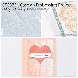
This week we are taking our inspiration from embossing projects in either catalogue.
I was inspired by this image from page 69 of the Annual Catalogue. The embossing on this one is pretty subtle, and to be honest it was the layout of this card that caught my eye, it was so inspirational that I actually made two cards inspired by this project.
Here is my first card. I have used the Jar of Flowers Stamps and in keeping with the inspiration project have embossed both the flowers and the container they are sitting in. I have used Textured Chic to create the Background banner and Distressed Gold Specialty Paper on on the side of the banner and to create the container for the flowers. For the container I coloured it with my Dark Evening Evergreen Stampin' Blend Marker to give it a different and more tarnished look. I used the basic colour palette from the original card, and while I like it, this card it was a little pale for my taste, so I decided to create a second card.
For this one I have used a different sheet of the Textured Chic DSP to create the banner, and kept the Distressed Gold strip. I have used some of the retired shimmery Vellum in Pale Papaya cutting and layering this using the Poppies dies. I love how well these coordinate with the flowers on the DSP.
Let me know in the comments below which card you prefer, and why.
I hope you are inspired to join in the challenge this week, just use any of the samples in the new Annual Catalogue to inspire your creativity, then post a picture of your project to the CTC Facebook page.
Time to hop on over and see what Julia has created this week.
Happy Stamping
Monique
Monique


Your cards are fantastic! I'm with you - I prefer the bolder colours. The poppy looks amazing, and what an awesome way to use the vellum.
ReplyDeleteBoth lovely cards but I really love the vellum poppies.
ReplyDeleteBoth are lovely cards. The way the bottom of the panels aren’t square under the flowers adds more interest to the cards.
ReplyDelete