Sunday, April 22, 2018

CTC #175 - Favourite Big Shot Project

Welcome to another week of CASEing the Catty Sunday Blog Hop, where we take inspiration from one of the many wonderful samples in the current Stampin' Up! catalogues, to create our own projects each week.

This week we are taking our inspiration from both catalogues and the wonderful Big Shot projects within their pages.

I took my inspiration from the little apron gift holder on page 47 of the Occasions Catalogue.  I was inspired both by this image for this challenge, but prior to that was inspired by a cute swap I received at Sydney On Stage made by Tracy Ross that inspired me to purchase this bundle!

Here is my little project, I have used the lovely Painted With Love Specialty DSP, to make the little apron, pairing it with Melon Mambo and Rich Razzleberry accessories.  The scissors are cut from Silver Foil paper and the handles coloured with permanent marker. As you can see this is the perfect size for a Tombow Glue, what a cute gift this would make for a fellow crafter!

 I hope you are inspired to join in with us this week, just take inspiration from any of the Big Shot projects, to enter just take a picture of your project and add it to the CTC Facebook Page.

Time to hop on over and see what the lovely and talented Rachel has created this week.

Happy Stamping
Monique

Wednesday, April 18, 2018

On Stage Presenter & Display Board Showcase Blog Hop

I was so honoured to receive a phone call from the lovely Donna Williams from Stampin' Up! home office here in Australia and to be asked to do a new product showcase at the On Stage event in Sydney.  I think I said "I would like to say yes" a bit nervously, to which Donna replied "then just say yes!" ... so I did and before I knew it was presenting in front of 600 of my closest demo friends ... and the CEO of the company!

My product showcase is the Sea Of Textures Bundle which includes 9 stamps and 8 Framelits which loosely coordinate. This means that the stamps and Framelits work beautifully together, but also look great used independently.  I discovered that the fish-scale stamp added some beautiful texture to the framelits you can see what a difference it makes - not stamped on the middle panel and stamped with scales on the right.  Just stamp the scales then line up your Framelit over the section you want to show on the final image. 

I have posted this picture of me with my display board on another post, but couldn't resist posting again!  Now to show you some of those projects close up:

One of the things that I shared about myself during my presentation was that when I was younger I lived on a yacht, making this bundle a really good fit for me.  I was determined to do a scrapbook layout of some kind, and turned to Memories and More to achieve this.  Page one of this two page layout is me sitting in the cockpit of Spindrift with a necklace of shells, much like sand  dollars and drinking from a fresh coconut - before coconut milk was popular! I love how the Sea of Textures elements fit so well with this time in my life.

This second page was a little harder to photograph with the plastic sleeve, but it gives you an idea of a few more uses for this amazing bundle. I used the negative space from the sand dollar to create a mask, using this to sponge detail onto the journal card and the background of my photograph.  You can see on the bottom picture how well the fish scales stamp gives texture to the starfish. This is probably my favourite photograph of me as a child and doing these two pages brought back so many happy memories. 

I just love this card, it was one of the first I created as I had been playing with my Brusho and realised that this would make the perfect under the sea background. I loved playing with the textures on this card, layering up the coral and seaweed stamps and Framelit cut outs.  The little school of fish I  created by stamping with the fish scale stamp then running the Framelit through the Big Shot, without removing the fish from the die, I added a small amount of Tombow glue to each one and positioned the whole Framelit over my card then gently pressed each one onto the card with a toothpick.  I added a few extra ones at the top of the card.  

Carrying on with the Brusho theme I wanted to try out the octopus using white embossing powder, I really like how he turned out.  The little net stamp gives some lovely texture behind the panel don't you think?
My next card is a bit more simple, and shows the versatility of this bundle. I wanted to keep this card more clean and simple. I used my sponge brayer to add some of the beautiful new Balmy Blue to some Whisper White before tearing the edge to create the "foam" on the waves.  I love how the little star in the centre of the sand dollars make cute little star fish. 

Speaking of Balmy Blue, I think this is my new faviourite blue, it is fresh and vibrant and I just love how it pairs so beautifully with a range of colours, here with Mossy Meadow, but also beautiful with Night of Navy, Berry Burst among many others.  I stamped the background of this card with the bubbles from Playful Backgrounds, which I am happy to see is carrying over into the new Annual Catalogue. I like the idea of the octopus actually reaching out of the "Polaroid". 
 
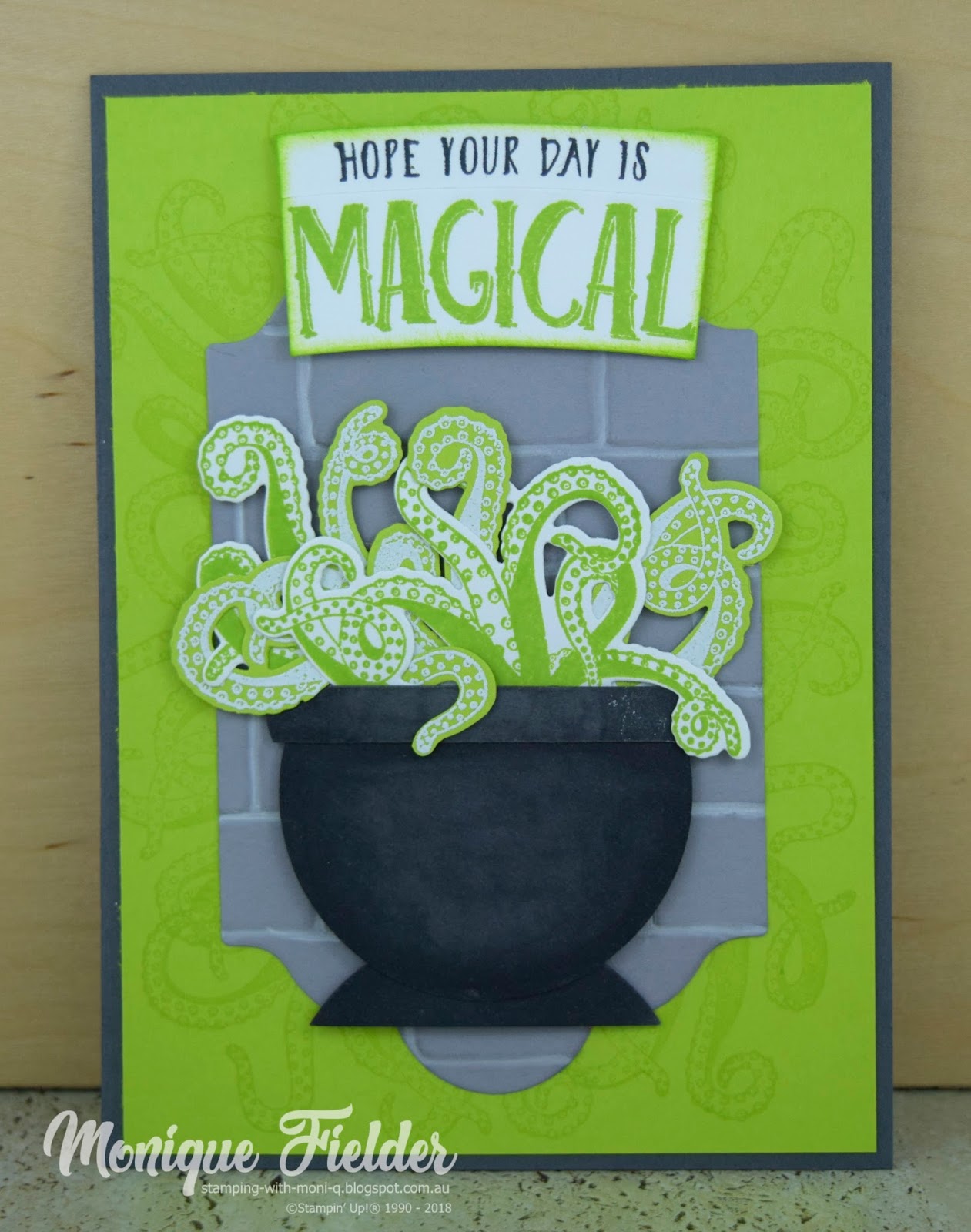
When I started to think about the Octopus I decided the tentacles would look great coming out of a cauldron.  I stamped Lemon Lime Twist onto Whisper White, and then embossed White onto Lemon Lime Twist to get variants of the colours. I cut the tentacles apart to layer them in and around each other.  The cauldron is made with a circle Framelit and strip of cardstock rounded on the edges for the rim. I am a bit sad that the Magical Day stamp set is retiring because it works so beautifully with this card.  If you look closely I have also stamped additional tentacles on the background in Versamark so they add subtle interest to the otherwise plain background.

My final card is another one that shows the versatility of this set, I used my Stamparatus and the small coral stamp to create the background wreath.  The sand dollar element makes the perfect "O" in Joy, making this a great bundle for Christmas too!  The You is cut from the Celebrate You Framelits, trimming down the "U" to create the "J".

I hope you are enjoying seeing the wonderful new products showcased by some very talented stampers whom I am honoured to be among this year.  Time to hop on over and see what the lovely Suze created for her presentation in Utrecht, Netherlands. 

Happy Stamping
Monique

Sunday, April 15, 2018

CTC #174 - Hostess Inspired

Welcome to another week at CASEing the Catty Sunday Blog Hop, where we take a look at one of the sections of a current Stampin' Up! catalogue  and use the projects featured in it to inspire our creations.  

This week we are looking at the Hostess and Memories and More samples in the Occasions and Annual Catalogues.  I was a bit taken by this cute little card on page 220 of the Annual Catalogue

I am excited to show you one of the new colours being added to the Stampin' Up! colour collections, the beautiful Balmy Blue which will be part of the revamped Subtles Collection.  I love the vibrancy to this blue, and it goes so well with Berry Burst.  I kept the layout very similar but moved the sentiment to the bottom of the centre panel.  The birds are from Colour Me Happy stamp set.

I hope you are able to join in this week, just use any of the Hostess or Memories and More projects in either catalogue to inspire your creation and post a picture of it to the CTC Facebook Page.

Time to hop on over and see what Julia has created this week.

Happy Stamping
Monique

Wednesday, April 11, 2018

On Stage - Sea of Textures Product Showcase

One of the great benefits of being a Stampin' Up! Demonstrator is that I get to attend On Stage events. These are amazing events where new catalogue products are showcased, and I get to catch up with some of my amazing Demo friends. 

The most recent On Stage event was extra special for me as I was privileged to be asked by Stampin' Up! to showcase one of the new bundles in a presentation!  The bundle was the Sea of Textures bundle, one that was close to my heart as I grew up living on a yacht, so felt that the ocean themed bundle was perfect for me.

I have to be honest I was more than a little nervous, but the back stage crew, and the Stampin' Up! staff were amazing at getting me prepared.  I decided to treat the presentation a bit like a workshop with 600 of my closest friends!

I wasn't sure what I would do with the octopus when I first saw the stamp set, but once I realised that his little tentacle sticking up in the air could hold things he really started to grow on me!  Here i have him holding up a sign stamped using Lovely Inside and Out.  Who better to send you hugs than a guy with 8 arms?

Taking it one step further I think he really came to life in my hands when I gave him some cool glasses from Truly Tailored and a drink from Colourful Seasons. This is one of my favourite cards with him, and from the reaction of the other demos I know he was popular all round. 

While some of these sets are retiring there are heaps of options in the new catalogue for him to hold. Picture him with a Santa or party hat, holding a glass of wine or passing a gift!  I can't wait to see what everyone else comes up with.

Another of my favourite cards using the Octopus is this Star Trek one, can you see what I used from the bundle?  The colours on the shirts are Cherry Cobbler, So Saffron and Balmy Blue (one of the new colours).

If you guessed this little cut out piece from the octopus framelit you would be right!  I happened to be watching Star Trek when I was playing with this and it didn't take long for me to realise how much like the communicator badge it looked!

Always looking for a different way to use our products I realised that the two sand dollar framelits made great holes for Swiss Cheese!  My little mouse was inspired by Melissa Davies and is made with a heart and circle punch. 

This little set of cards I made to showcase some of the great colour combos that suite the octopus. With our Stampin' Pads being a water based ink they are perfect to colour with Stampin' Blends. My tip for these is to stamp in a darker colour and use a lighter colour on the tentacles so the little details still show through. 
  
This is me with my display board after my presentation.  If you come back here and visit on 18 April I am participating in a blog hop of display and presenting demonstrators and will have even more of my creations for you to see.

Happy Stamping
Monique