I love the 2 step bird punch just out in the new Autumn/Winter mini, at first I thought "yeah nice, but how versatile?" then did some looking at others and found a few options and looks achievable from this lovely punch. Here are some of my efforts ...
 Birds wings as tulips and leaves - saw this a few times on SCS and just had to try them out. The petals are from Almost Apricot and leaves and stems from Certainly Celery (I think). I sponged the petals in Pretty In Pink, the leaves sponged with Old Olive. I used the Circles #2 Die and the Perfect Polka Dots embossing folder for the background. Just a 3"x3" card, mostly to play with the technique. Background is Kraft.
 This one I did for a challenge on SCS but had lost my camera so couldn't post it for the challenge, it was one of the challenges where you take inspiration from another person's card. The original was a white card with 3 stamped apples i think, the paper piercing and the words very similar. This was also part of a colour challenge (multi-tasking again). Just cranky I didn't get to post on SCS as I often look at the challenges but rarely jump in and do them!
 Again playing with my favourite colours of the moment - Rich Razzleberry, Old Olive, and Orchid Opulence. I like the Cottage Wall DSP as well and think it works well in this card. I added a few extra branch clippings to the main branch just to add some colour and depth to the area.
 Another 3"x3" card using some pen work and DSP on the bird to add some depth to it. Again just playing with my new toys rather than making a card to use so to speak, not happy with the sponging around the edge, would tidy that up in a "real" card.
Last one ... I had some spare scraps of the DSP and wanted to do a simple 3"x3" card, I like the use of the DSP like this, flipping the paper over on the diagonal pieces gives a nice effect. Again used the Big Shot to emboss and cut the circle used in the background.
When embossing and cutting - if you want a strong emboss then do the cutting first, as the cutting process will squash down the embossed areas giving a more subtle effect.


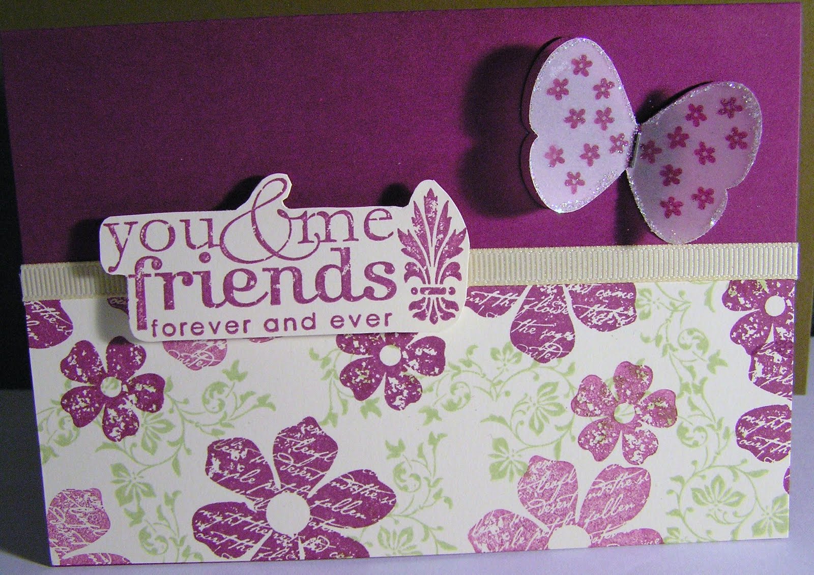
 This card I used Apricot Appeal for the base, and my own DSP on the lower section of the top note using the Vintage Vogue and Country Garden stamp sets from the Autumn/Winter mini catalogue. Colours used Apricot Appeal, Old Olive and Rich Razzleberry.


 I printed out and cut a cross on computer paper then used the cut out cross as a mask and coloured the background using Pastels, I used the yellow to make the apperance of a halo. The cross on the page looked a bit too plain and stark, so used the vine stamp out of Vingage Vogue set from the Autumn/Winter mini, to create the effect of vines on the cross. To do this I used the paper which I cut the original cross out of to mask the card. Vingage Vogue flowers and leaves were added with half pearls in the centre. I can't remember the exact colours used but think it was So Saffron, Elegant Eggplant and one of the greens. I was so happy with it I made another one for my in-laws also.